 Attraction11
StyleSheet
RN 中的样式与 CSS 的区别
StyleSheet 是 RN 中用来声明样式的语法
- RN 中的样式,没有继承性(子组件不能继承父组件的样式)
- CSS:Cascading Style Sheet(级联样式表)
- SS:Style Sheet(样式表)
- 样式名称使用小驼峰式命名
- 例如:CSS 中的 font-size,在 RN 中写成 fontSize
- 所有尺寸都是没有单位
- 例如:width: 100 这是因为 RN 中尺寸只有一个单位,dp( 一种基于屏幕密度的抽象单位,默认省略。详情查看 PixelRatio)
js
import { PixelRatio } from "react-native";
const dp2px = (dp) => PixelRatio.getPixelSizeForLayoutSize(dp);
const px2dp = (px) => PixelRatio.roundToNearestPixel(px);
// 按照下面的方式可实现 px 与 dp 之间的转换(比如 100px*200px 的 View)
<View
    style={{ width: px2dp(100), height: px2dp(200), backgroundColor: "red" }}
/>;
- RN 中有些样式名的写法与 CSS 不同。例如:marginVertical
RN 样式的声明方式
通过 style 属性直接声明
- 属性值是对象
js// 基本用法 <Text style={{color: '#e33', fontSize: 30}}> Hello World </Text> // 越靠后的样式,优先级越高;下面字体显示为蓝色 <Text style={{color: 'red', color: 'blue',}}> Hello World </Text>// 基本用法 <Text style={{color: '#e33', fontSize: 30}}> Hello World </Text> // 越靠后的样式,优先级越高;下面字体显示为蓝色 <Text style={{color: 'red', color: 'blue',}}> Hello World </Text>- 属性值是数组
js// 数组元素是对象,这样可以传入多个样式对象,方便构造复杂的样式效果 <Text style={[{ fontSize: 40 }, { color: "green" }]}> Hello World </Text>// 数组元素是对象,这样可以传入多个样式对象,方便构造复杂的样式效果 <Text style={[{ fontSize: 40 }, { color: "green" }]}> Hello World </Text>通过 StyleSheet 声明(推荐)
js// 引入 StyleSheet import { Text, StyleSheet } from "react-native"; <View style={styles.container}> <Text style={styles.red}>Hello World</Text> {/* 数组中可以传入多个样式 */} <Text style={[styles.red, styles.fontLarge]}>Hello RN</Text> <Text style={[styles.red, styles.fontMedium]}>Hello RN</Text> <Text style={[styles.red, styles.fontSmall]}>Hello RN</Text> </View>; // 通过 StyleSheet.create({}) 创建样式,与组件内容分开(使用 StyleSheet 之前要先引入) const styles = StyleSheet.create({ container: { marginTop: 50, }, red: { color: "red", }, fontLarge: { fontSize: 40, }, fontMedium: { fontSize: 30, }, fontSmall: { fontSize: 20, }, });// 引入 StyleSheet import { Text, StyleSheet } from "react-native"; <View style={styles.container}> <Text style={styles.red}>Hello World</Text> {/* 数组中可以传入多个样式 */} <Text style={[styles.red, styles.fontLarge]}>Hello RN</Text> <Text style={[styles.red, styles.fontMedium]}>Hello RN</Text> <Text style={[styles.red, styles.fontSmall]}>Hello RN</Text> </View>; // 通过 StyleSheet.create({}) 创建样式,与组件内容分开(使用 StyleSheet 之前要先引入) const styles = StyleSheet.create({ container: { marginTop: 50, }, red: { color: "red", }, fontLarge: { fontSize: 40, }, fontMedium: { fontSize: 30, }, fontSmall: { fontSize: 20, }, });在实际开发中。样式值还可以通过变量的方式指定,例如:
js<View style={[ styles.base, { width: this.state.width, height: this.state.width * this.state.aspectRatio, }, ]} /><View style={[ styles.base, { width: this.state.width, height: this.state.width * this.state.aspectRatio, }, ]} />
注意:RN 中的样式不支持 Less 或 Sass 中的 MIxin 特性(这也是一直被吐槽的)
RN 中的 flexbox 布局
- 传统布局方式
- 文档流布局:根据代码出现的先后顺序布局,先出现的在前,后出现的在后
- 浮动:例如:左浮动,有浮动,清除浮动等;可以打破文档流的固有模式,实现更为丰富的布局
- 定位:绝对定位,相对定位,固定定位
- 传统布局方式,对于那些特殊布局非常不方便,比如,垂直居中就不容易实现。
基于此,2009 年,W3C 提出了一种新的方案:Flex 布局,可以简便、完整、响应式地实现各种页面布局。 Flexbox 规范详情:https://www.w3.org/TR/css-flexbox-1
Flexbox 意为"弹性布局"
设为 Flex 布局以后,子元素的 float 、 clear 和 vertical-align 属性将失效
css
div {
    display: flex;
}
div {
    display: flex;
}
- 术语
- 容器:采用 Flex 布局的元素,称为 Flex 容器(flex container),简称"容器"。
- 项目:它的所有子元素自动成为容器成员,称为 Flex 项目(flex item),简称"项目
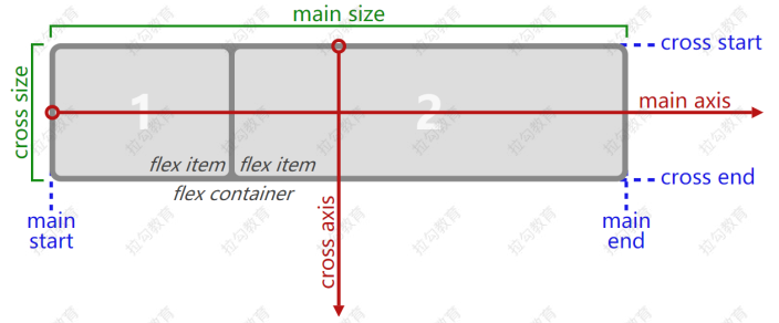
容器默认存在两根轴:主轴(main axis)和交叉轴(cross axis)。 主轴的开始位置(与边框的交叉点)叫做 main start ,结束位置叫做 main end ; 交叉轴的开始位置叫做 cross start ,结束位置叫做 cross end 项目默认沿主轴排列。单个项目占据的主轴空间叫做 main size ,占据的交叉轴空间叫做 cross size
属性
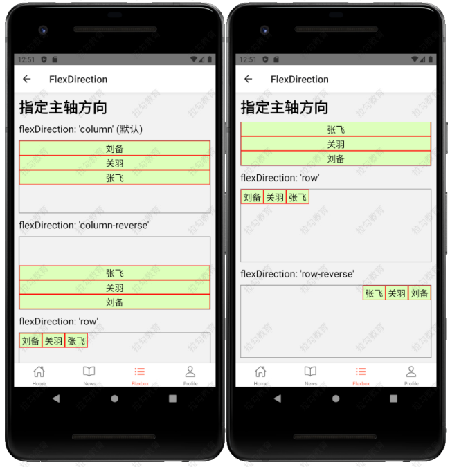
- flexDirection 用来指定主轴方向(CSS 中对应的属性名是: flex-direction)
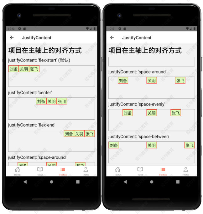
- justifyContent (CSS 中对应的属性名是 justify-content)用来指定项目在主轴上的对齐方式
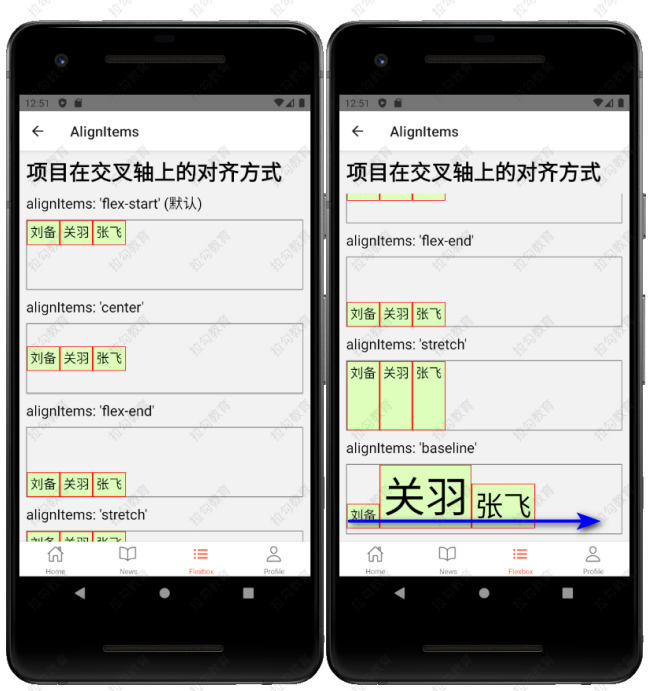
- alignItems (CSS 中对应的属性名是 align-items)用来指定项目在交叉轴上的对齐方式
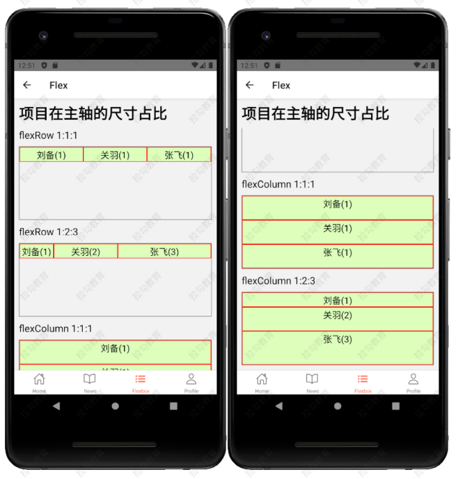
- flex 是以数字的方式,来声明项目在主轴上的尺寸占比